The scatterplot is a plot with many data points. It is one of the many plots seaborn can create. Seaborn is a Python module for statistical data visualization.
Seaborn can create this plot with the scatterplot() method. The data points are passed with the parameter data. The parameters x and y are the labels of the plot.
Practice now: Test your Python skills with interactive challenges
Scatterplot
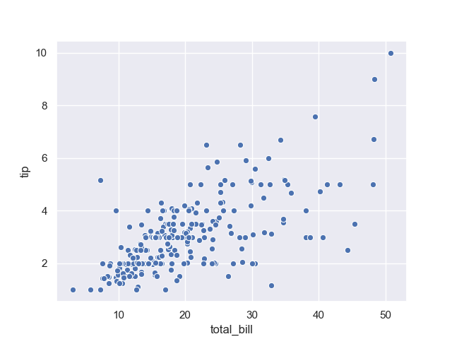
scatterplot basic
The scatterplot basic plot uses the tips dataset. This is a dataset about tips received based on the total bill. You can use any dataset you want for a scatterplot, this just serves as basic example.
import numpy as np
import pandas as pd
import matplotlib as mpl
import matplotlib.pyplot as plt
import seaborn as sns

tips = sns.load_dataset("tips")
sns.set(color_codes=True)
ax = sns.scatterplot(x="total_bill", y="tip", data=tips)
plt.show()
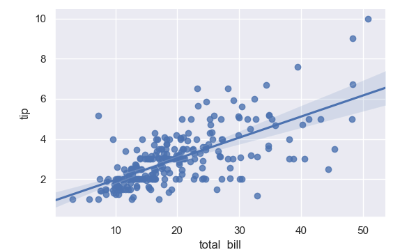
scatterplot
The scatterplot plot can also contain a line. To do that, use an lmplot instead. This nicely shows the relation between the datapoints.
import numpy as np
import pandas as pd
import matplotlib as mpl
import matplotlib.pyplot as plt
import seaborn as sns
sns.set(color_codes=True)
np.random.seed(sum(map(ord, "regression")))
tips = sns.load_dataset("tips")
tips.head()
sns.lmplot(x="total_bill", y="tip", data=tips)
plt.show()
Practice now: Test your Python skills with interactive challenges