A heatmap is a plot of rectangular data as a color-encoded matrix. As parameter it takes a 2D dataset. That dataset can be coerced into an ndarray.
This is a great way to visualize data, because it can show the relation between variabels including time. For instance, the number of fligths through the years.
Practice now: Test your Python skills with interactive challenges
heatmap example
heatmap
The heatmap plot below is based on random values generated by numpy. Many parameters are possible, this just shows the most basic plot.
import pandas as pd
import numpy as np
import seaborn as sns
import matplotlib.pyplot as plt

np.random.seed(0)
sns.set()
uniform_data = np.random.rand(10, 12)
ax = sns.heatmap(uniform_data, vmin=0, vmax=1)
plt.show()

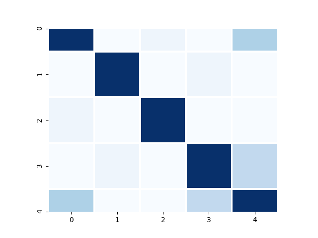
heatmap colors
The heatmap colors plot below uses random data again. This time it's using a different color map (cmap), with the 'Blues' palette which as nothing but colors of bue. It also uses square blocks.
import pandas as pd
import numpy as np
import seaborn as sns
import matplotlib.pyplot as plt

df = pd.DataFrame(np.random.randn(50).reshape(10,5))
corr = df.corr()

ax1 = sns.heatmap(corr, cbar=0, linewidths=2,vmax=1, vmin=0, square=True, cmap='Blues')
plt.show()
heatmap data
The heatmap data plot is similar, but uses a different color palette. It uses the airline or flights dataset that's included in seaborn.
import pandas as pd
import numpy as np
import seaborn as sns
import matplotlib.pyplot as plt

sns.set()
flights = sns.load_dataset("flights")
flights = flights.pivot("month", "year", "passengers")
ax = sns.heatmap(flights)
plt.title("Heatmap Flight Data")
plt.show()

Practice now: Test your Python skills with interactive challenges