Seaborn supports many types of bar plots. We combine seaborn with matplotlib to demonstrate several plots.
Several data sets are included with seaborn (titanic and others), but this is only a demo. You can pass any type of data to the plots.
Practice now: Test your Python skills with interactive challenges
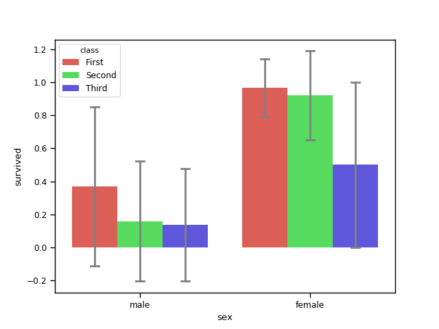
barplot example
barplot
Create a barplot with the barplot() method. The barplot plot below shows the survivors of the titanic crash based on category. You'll see these bar charts go down as the ship was sinking :)
The palette parameter defines the colors to be used, currently 'hls' is used but any palette is possible.
import numpy as np
import pandas as pd
import matplotlib.pyplot as plt
import seaborn as sns

sns.set_context('paper')

# load dataset
titanic = sns.load_dataset('titanic')
print(titanic.head())

# create plot
sns.barplot(x = 'sex', y = 'survived', hue = 'class', data = titanic,
            palette = 'hls',
            order = ['male', 'female'],
            capsize = 0.05,
            saturation = 8,
            errcolor = 'gray', errwidth = 2,
            ci = 'sd'
            )

print(titanic.groupby(['sex', 'class']).mean()['survived'])
print(titanic.groupby(['sex', 'class']).std()['survived'])

plt.show()
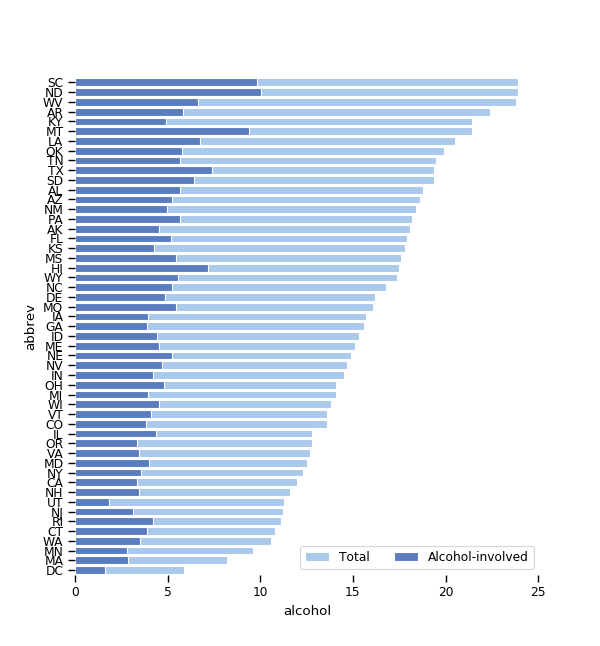
barplot horizontal
The barplot can be a horizontal plot with the method barplot(). In the example below two bar plots are overlapping, showing the percentage as part of total crashes.
import numpy as np
import pandas as pd
import matplotlib.pyplot as plt
import seaborn as sns

sns.set_context('paper')

crashes = sns.load_dataset('car_crashes').sort_values('total', ascending = False)
f, ax = plt.subplots(figsize = (6,15))
sns.set_color_codes('pastel')
sns.barplot(x = 'total', y = 'abbrev', data = crashes,
            label = 'Total', color = 'b', edgecolor = 'w')
sns.set_color_codes('muted')
sns.barplot(x = 'alcohol', y = 'abbrev', data = crashes,
            label = 'Alcohol-involved', color = 'b', edgecolor = 'w')
ax.legend(ncol = 2, loc = 'lower right')
sns.despine(left = True, bottom = True)
plt.show()
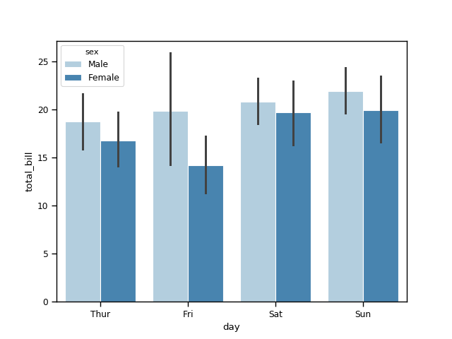
barplot tips
The barplot tips plot below uses the tips data set. It shows the number of tips received based on gender. Its uses the blues palette, which has variations of the color blue.
import numpy as np
import pandas as pd
import matplotlib.pyplot as plt
import seaborn as sns

sns.set_context('paper')

tips = sns.load_dataset('tips')
sns.barplot(x = 'day', y = 'total_bill', hue = 'sex', data = tips,
            palette = 'Blues', edgecolor = 'w')
tips.groupby(['day','sex']).mean()

plt.show()
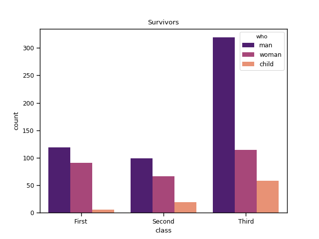
countplot
The countplot plot can be thought of as a histogram across a categorical variable. The example below demonstrates the countplot.
import numpy as np
import pandas as pd
import matplotlib.pyplot as plt
import seaborn as sns

sns.set_context('paper')

# load dataset
titanic = sns.load_dataset('titanic')
print(titanic.head())

# create plot
sns.countplot(x = 'class', hue = 'who', data = titanic, palette = 'magma')
plt.title('Survivors')
plt.show()
Practice now: Test your Python skills with interactive challenges