Line charts work out of the box with matplotlib. You can have multiple lines in a line chart, change color, change type of line and much more.
Matplotlib is a Python module for plotting. Line charts are one of the many chart types it can create.
Practice now: Test your Python skills with interactive challenges
Line chart examples
Line chart
First import matplotlib and numpy, these are useful for charting. You can use the plot(x,y) method to create a line chart.
import matplotlib.pyplot as plt
import numpy as np

x = np.linspace(-1, 1, 50)
print(x)
y = 2*x + 1

plt.plot(x, y)
plt.show()

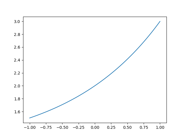
Curved line
The plot() method also works for other types of line charts. It doesn't need to be a straight line, y can have any type of values.
import matplotlib.pyplot as plt
import numpy as np

x = np.linspace(-1, 1, 50)
y = 2**x + 1

plt.plot(x, y)
plt.show()
Python Data Visualization Bundle →
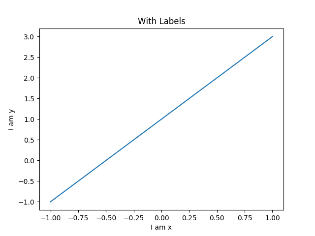
Line with Labels
To know what you are looking at, you need meta data. Labels are a type of meta data. They show what the chart is about. The chart has an x label, y label and title.
import matplotlib.pyplot as plt
import numpy as np

x = np.linspace(-1, 1, 50)
y1 = 2*x + 1
y2 = 2**x + 1

plt.figure()
plt.plot(x, y1)

plt.xlabel("I am x")
plt.ylabel("I am y")
plt.title("With Labels")

plt.show()
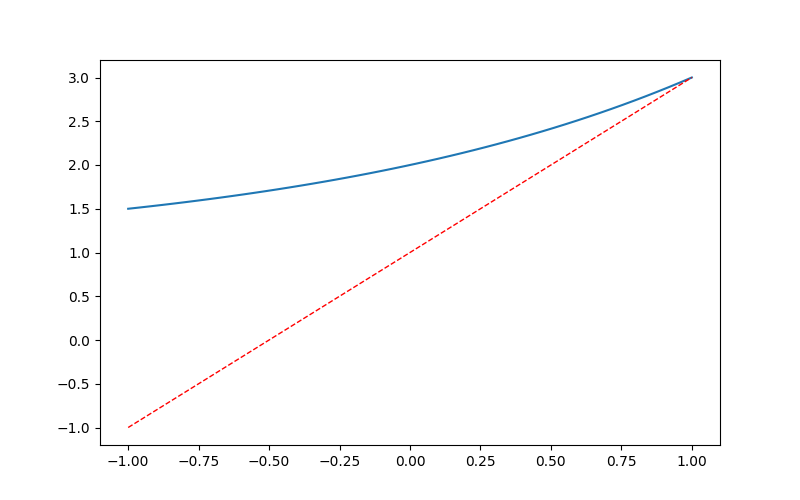
Multiple lines
More than one line can be in the plot. To add another line, just call the plot(x,y) function again. In the example below we have two different values for y (y1,y2) that are plotted onto the chart.
import matplotlib.pyplot as plt
import numpy as np

x = np.linspace(-1, 1, 50)
y1 = 2*x + 1
y2 = 2**x + 1

plt.figure(num = 3, figsize=(8, 5))
plt.plot(x, y2)
plt.plot(x, y1,
         color='red',
         linewidth=1.0,
         linestyle='--'
        )

plt.show()
Dotted line
Lines can be in the form of dots like the image below. Instead of calling plot(x,y) call the scatter(x,y) method. The scatter(x,y) method can also be used to (randomly) plot points onto the chart.
import matplotlib.pyplot as plt
import numpy as np

n = 1024
X = np.random.normal(0, 1, n)
Y = np.random.normal(0, 1, n)
T = np.arctan2(X, Y)

plt.scatter(np.arange(5), np.arange(5))

plt.xticks(())
plt.yticks(())

plt.show()

Python Data Visualization Bundle →
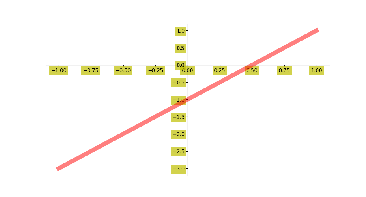
Line ticks
You can change the ticks on the plot. Set them on the x-axis, y-axis or even change their color. The line can be more thick and have an alpha value.
import matplotlib.pyplot as plt
import numpy as np

x = np.linspace(-1, 1, 50)
y = 2*x - 1

plt.figure(figsize=(12, 8))
plt.plot(x, y, color='r', linewidth=10.0, alpha=0.5)

ax = plt.gca()

ax.spines['right'].set_color('none')
ax.spines['top'].set_color('none')

ax.xaxis.set_ticks_position('bottom')
ax.yaxis.set_ticks_position('left')

ax.spines['bottom'].set_position(('data', 0))
ax.spines['left'].set_position(('data', 0))

for label in ax.get_xticklabels() + ax.get_yticklabels():
    label.set_fontsize(12)
    label.set_bbox(dict(facecolor='y', edgecolor='None', alpha=0.7))

plt.show()
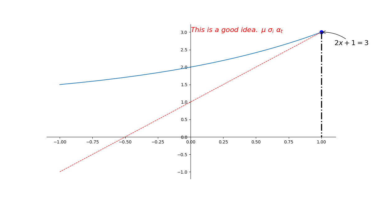
Line with asymptote
An asymptote can be added to the plot. To do that, use plt.annotate(). There's lso a dotted line in the plot below. You can play around with the code to see how it works.
import matplotlib.pyplot as plt
import numpy as np

x = np.linspace(-1, 1, 50)
y1 = 2*x + 1
y2 = 2**x + 1

plt.figure(figsize=(12, 8))
plt.plot(x, y2)
plt.plot(x, y1, color='red', linewidth=1.0, linestyle='--')

ax = plt.gca()

ax.spines['right'].set_color('none')
ax.spines['top'].set_color('none')

ax.xaxis.set_ticks_position('bottom')
ax.yaxis.set_ticks_position('left')

ax.spines['bottom'].set_position(('data', 0))
ax.spines['left'].set_position(('data', 0))


x0 = 1
y0 = 2*x0 + 1

plt.scatter(x0, y0, s = 66, color = 'b')
plt.plot([x0, x0], [y0, 0], 'k-.', lw= 2.5)

plt.annotate(r'$2x+1=%s$' %
             y0,
             xy=(x0, y0),
             xycoords='data',

             xytext=(+30, -30),
             textcoords='offset points',
             fontsize=16,
             arrowprops=dict(arrowstyle='->',connectionstyle='arc3,rad=.2')
            )

plt.text(0, 3,
         r'$This\ is\ a\ good\ idea.\ \mu\ \sigma_i\ \alpha_t$',
         fontdict={'size':16,'color':'r'})

plt.show()
Line with text scale
It doesn't have to be a numeric scale. The scale can also contain textual words like the example below. In plt.yticks() we just pass a list with text values. These values are then show against the y axis.
import matplotlib.pyplot as plt
import numpy as np

x = np.linspace(-1, 1, 50)
y1 = 2*x + 1
y2 = 2**x + 1

plt.figure(num = 3, figsize=(8, 5))
plt.plot(x, y2)

plt.plot(x, y1,
         color='red',
         linewidth=1.0,
         linestyle='--'
        )

plt.xlim((-1, 2))
plt.ylim((1, 3))

new_ticks = np.linspace(-1, 2, 5)
plt.xticks(new_ticks)
plt.yticks([-2, -1.8, -1, 1.22, 3],
          [r'$really\ bad$', r'$bad$', r'$normal$', r'$good$', r'$readly\ good$'])

ax = plt.gca()
ax.spines['right'].set_color('none')
ax.spines['top'].set_color('none')

ax.xaxis.set_ticks_position('bottom')
ax.yaxis.set_ticks_position('left')

ax.spines['bottom'].set_position(('data', 0))
ax.spines['left'].set_position(('data', 0))

plt.show()

Practice now: Test your Python skills with interactive challenges