Bar charts can be made with matplotlib. You can create all kinds of variations that change in color, position, orientation and much more. So what's matplotlib?
Matplotlib is a Python module that lets you plot all kinds of charts. Bar charts is one of the type of charts it can be plot. There are many different variations of bar charts.
Practice now: Test your Python skills with interactive challenges
Example
Bar chart
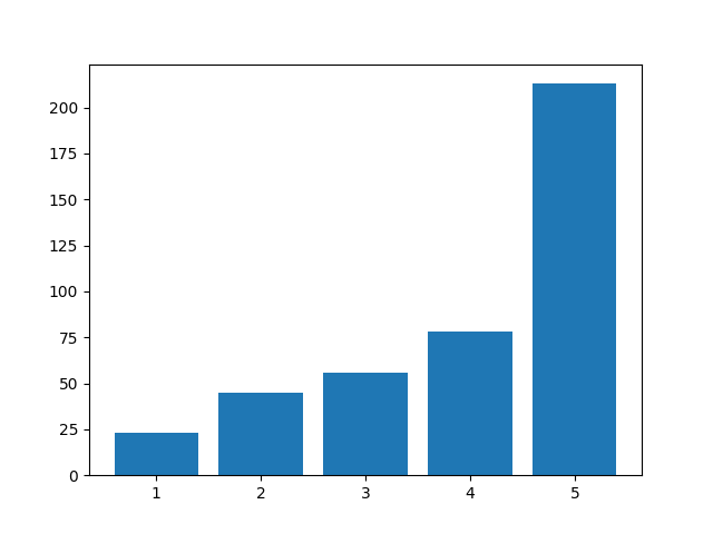
The method bar() creates a bar chart. So how do you use it? The program below creates a bar chart. We feed it the horizontal and vertical (data) data.
#!/usr/bin/python3
import numpy as np
import pandas as pd
from pandas import Series, DataFrame
import matplotlib.pyplot as plt

data = [23, 45, 56, 78, 213]
plt.bar([1,2,3,4,5], data)
plt.show()
Plot color
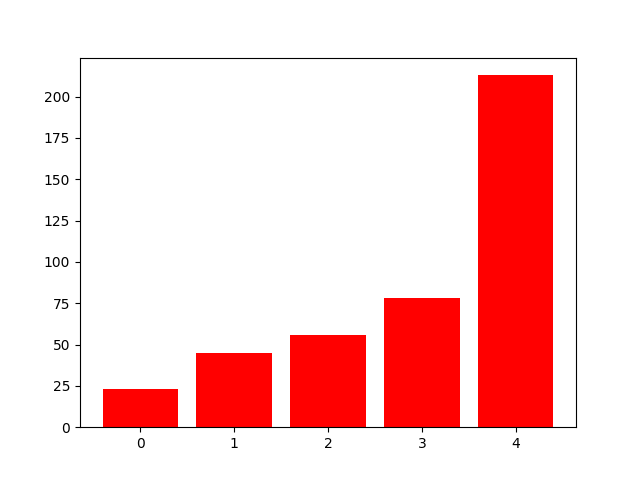
You can change the color of the bar chart. To do that, just add the color parameter. The parameter can be set to an English color definition like 'red'.
Example:
import numpy as np
import pandas as pd
from pandas import Series, DataFrame
import matplotlib.pyplot as plt

data = [23, 45, 56, 78, 213]
plt.bar(range(len(data)), data, color='red')
plt.show()
Python Data Visualization Bundle →
Grid lines
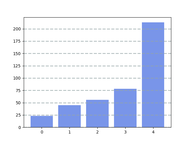
If you want grid lines, you can do that. Add the function call .grid() with color, linestyle, width and axis. Optionally you can add an alpha value.
Code like this:
import numpy as np
import pandas as pd
from pandas import Series, DataFrame
import matplotlib.pyplot as plt

data = [23, 45, 56, 78, 213]

plt.bar(range(len(data)), data, color='royalblue', alpha=0.7)
plt.grid(color='#95a5a6', linestyle='--', linewidth=2, axis='y', alpha=0.7)
plt.show()
Python Data Visualization Bundle →
Matplotlib labels
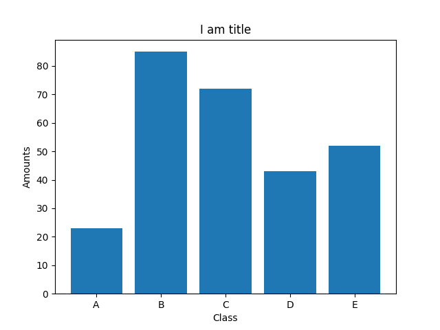
Plots need a description. What's the use of a plot, if the viewer doesn't know what the numbers represent. Do you want to add labels?
The code below adds labels to a plot.
import numpy as np
import pandas as pd
from pandas import Series, DataFrame
import matplotlib.pyplot as plt

data = [23,85, 72, 43, 52]
labels = ['A', 'B', 'C', 'D', 'E']
plt.xticks(range(len(data)), labels)
plt.xlabel('Class')
plt.ylabel('Amounts')
plt.title('I am title')
plt.bar(range(len(data)), data)
plt.show()
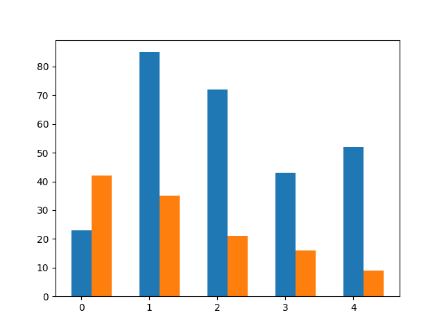
Multiple charts
You can plot multiple bar charts in one plot. Need multiple bar charts?
The code below adds two bar chars by calling the method twice. A width parameter is specified.
import numpy as np
import pandas as pd
from pandas import Series, DataFrame
import matplotlib.pyplot as plt

data1 = [23,85, 72, 43, 52]
data2 = [42, 35, 21, 16, 9]
width =0.3
plt.bar(np.arange(len(data1)), data1, width=width)
plt.bar(np.arange(len(data2))+ width, data2, width=width)
plt.show()
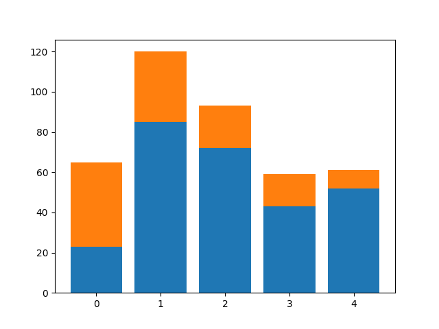
Stack charts
You can stack bar charts on top of each other. That is particulary useful when you multiple values combine into something greater.
import numpy as np
import pandas as pd
from pandas import Series, DataFrame
import matplotlib.pyplot as plt

data1 = [23,85, 72, 43, 52]
data2 = [42, 35, 21, 16, 9]
plt.bar(range(len(data1)), data1)
plt.bar(range(len(data2)), data2, bottom=data1)
plt.show()
Practice now: Test your Python skills with interactive challenges